 Articles: 1,400 · Readers: 740,000 · Views: 2,209,961
 Sales forecasting predicts future level of sales in a business from past sales data. Business managers rely on this data, which has been kept over a given period of time since it occurred, to predict the future.
What is simple linear regression in sales forecasting?
Simple linear regression is a method of sales forecasting that is focused on studying the relationships between two quantitative variables such as sales values and sales volumes. It can measure how strong the relationship is by determining the value of one variable at the certain value of another variable, for example impact of advertising spending on sales revenue.
One variable X on the x-axis is independent, also called predictor or explanatory. And, the other variable Y on the y-axis is dependent on the first one, also called outcome or response. The response variable Y is the amount of sales revenue and the predictor variable X is the amount of money the business spent on advertising. In short, Y depends on X.
Estimating the relationship between two observations can help business managers to make predictions and strategic decisions in order to avoid uncertainty.
Methods of simple linear regression in sales forecasting
There are several simple linear regression methods that can be used to analyze the relationship between two variables:
- Correlation. This shows that there is a relationship between two different variables in the data set.
- Scatter Diagrams. This shows on the chart all the correlations between two different variables in the data set.
- Line of Best Fit. This shows the straight regression line going through the middle of all points (correlations) on the scatter diagram.
Sales forecasting is done in order to help the business identify in advance any problems and opportunities related to sales of products.
1. Correlation
Correlation is a very popular statistical business tool used in marketing.
What correlation shows?
Correlation indicates that there is a relationship between two variables, events, facts, numbers, values, observations, etc.
As correlation also shows the degree to which two variables are related, marketing managers are the most interested in establishing relationships between marketing spending and sales growth.
Benefits of correlation to the business
The most important is that correlation can help the business to increase future sales.
If in the past higher spending on promotion had led to significant increases in sales, then a relationship might be established between promotion expenditure and sales. Based on that connection, any future changes in spending on promotion could then be used to make predictions about any future changes in sales.
Hence, correlation can help business managers with planning the allocation of scarce resources. Specifically, the firm will be spending money on things that help to increase sales rather than on anything uncorrelated.
Examples of correlation
The most common correlation is the relationship between advertising expenditure and consumer spending on a particular product.
Another popular correlation is linking the amount of marketing expenditure and increase in market share. As well as the connection between sales of a good and different seasons of the year.
I came up with a funny example of correlation when younger managers have more hair on head, and older managers have less hair on head. Funny! Isn’t it?
Types of correlations
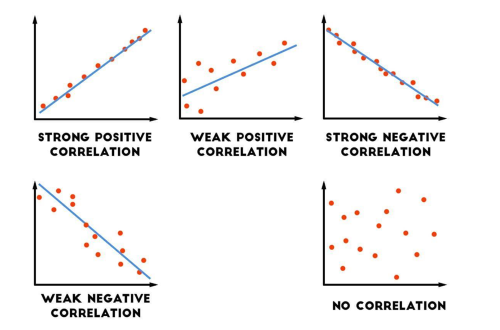
Correlation can be either positive, negative or there might be no correlation whatsoever. Let’s take a look at the most common types of correlations
- Positive correlation: In positive correlation between promotion spending and sales, both are moving in the same direction. When sales are rising then promotion spending is also rising. And when sales are falling then promotion spending is also falling.
- Negative correlation: In negative correlation between employee training and work-related injuries, both are moving in the opposite direction. When employees have more training then work-related injuries are falling. And when employees have less training then work-related injuries are rising.
- No correlation: When there is no correlation between promotion spending and sales, these two behave in an unconnected manner.
Correlation can also show the extent of that connection between those two items in the dataset – whether it is strong, moderate or weak:
- Strong: The closer the relationship between two items, the stronger the correlation – the higher the correlation coefficient. Observations on the scatter diagram will be located closer to the Line of Best Fit.
- Weak: The farther the relationship between two items, the weaker the correlation – the lower the correlation coefficient. Observations on the scatter diagram will be located farther away from the Line of Best Fit.
Advantages of correlation
There are a few benefits of correlation for a business organization:
- The blue curve called Line of Best Fit can be added to the scatter diagram to extend correlation into the future. This will help to make a sales forecast based on future spending on promotion.
- Correlation may also help to explain causation – identify factors that cause changes in sales to further improve sales.
- Correlation can be added into any future trend extrapolations when considering both positive and negative variables.
Disadvantages of correlation
There are also a few drawbacks of correlation:
- While correlation is when two events are connected, one event has not necessarily caused the occurrence of another event. Correlation does not confirm that there is a cause and an effect. It only shows that the relationship between two phenomena exists.
- Correlation does not explain the reason why such a relationship exists in the first place. Simply, as something happened, it dot not mean that something else caused it. The act is not producing the effect. Sales could have been increasing for many different reasons not only because of higher spending on promotion.
- Numbers can often be manipulated to prove a certain point of view; therefore any interpretation of data must be treated with caution. Ensuring correctness and accuracy of data is important to come up with reliable correlations.
In summary, many causal links that indicate correlation exist in the economy, for instance, between sales and prices (known as Price Elasticity of Demand (PED)), competitors’ promotional activity leading to increased competitors’ sales (known as Cross Elasticity of Demand (CED)), changes in commission payments to sales staff, levels of disposable income depending on TAX levels in a country, supply and prices (known as Price Elasticity of Supply (PES)), etc.
There are of course many more factors depending on the business and the products it is selling. Any changes in the internal business environment or external business environment that are either positively correlated or negatively correlated with sales must be incorporated into any predictions of future sales.
2. Scatter diagrams
Do you know how to visually show correlation? To illustrate correlation, scatter diagrams are used to show a linked pattern between two variables, events, facts, numbers, values, observations, etc.
What is a scatter diagram?
A scatter diagram is a business tool that can be used to show relationships between two different variables in a dataset, e.g. marketing spending and sales.
A scatter diagram shows coordinate data points that plot the values on a Cartesian Graph. The values of one variable are plotted on the x-axis (marketing spending) and the values of the other variable are plotted on the y-axis (sales).
What are relationships in a scatter diagram?
The following shows different types of correlation between marketing spending and sales. In general, relationships in a scatter diagram fall into three broad categories such as positive correlation, negative correlation and no correlation.
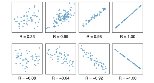
The most commonly used correlation coefficient is the Pearson coefficient (r) which ranges from -1.0 to +1.0. The stronger the correlation, the higher the correlation coefficient within the boundaries -1.0 and +1.0.
1. POSITIVE CORRELATION (from 0 to 1). A positive correlation means the two variables move in the same direction on the scatter diagram. When sales are rising then promotion spending is also rising. And when sales are falling then promotion spending is also falling.
– Positive strong correlation: from 0.0 to 0.5
– Positive moderate correlation: 0.5
– Positive weak correlation: from 0.5 to 1.0
2. NEGATIVE CORRELATION (from -1 to 0). A negative correlation means the two variables move in the opposite direction on the scatter diagram. When sales are rising then promotion spending is also rising. And when sales are falling then promotion spending is also falling.
– Negative strong correlation: from -1.0 to -0.5
– Negative moderate correlation: -0.5
– Negative weak correlation: from -0.5 to 0.0
3. NO CORRELATION (r=0). When correlation equals zero, there is no correlation between the two variables, if the data sets do not show a positive or negative correlation. Promotion spending and sales behave in an unconnected uncoordinated manner.
The following charts show how different types of correlations look when placed on Cartesian Graphs:
Example of a scatter diagram
The marketing director of a famous multinational company selling consumer electronics wants to know whether the company’s advertising spending is increasing the number of products sold around the world.
The information needed for each product sold in order to plot a scatter diagram for this purpose are advertising expenses (on the x-axis) and the sales revenue received from each product sold in the subsequent time period (on the y-axis).
Each product sold has one dedicated point on the scatter diagram. For example, the largest advertising spending of USD$370 generated the largest amount in sales revenue of USD$159,000.
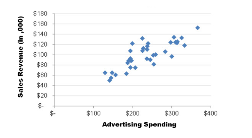
The pattern of the data points on the scatter diagram above suggests that there is a positive moderate correlation between advertising expenses and the sales revenue received from each product sold. Hence, the diagram suggests these two variables are related to one another in a medium way. There is some evidence to suggest that higher spending on promotion will increase future sales of the product.
In conclusions, scattered diagrams are used to visualize correlations because presenting data in the table does provide managers with meaningful interpretation of raw numbers.
3. Line of best fit
A Line of Best Fit on the scatter diagram goes through the middle of all data points.
Why is a Line of Best Fit important?
A Line of Best Fit, which visualizes correlation, best expresses the relationship between the scatter plots of data points. A Line of Best Fit fits all the data points in a scatter diagram.
What does a Line of Best Fit look like?
The closer the data points are to the line, the stronger the relationship between variables in the dataset.
A moderate correlation, either positive or negative, exists, if a Line of Best Fit can be easily determined, but the scatter data points are not placed very closely along the line.
The farther the data points are from the line, the weaker the relationship is.
The following charts show a few examples of the relationship between the two variables being investigated:
How to construct a Line of Best Fit?
In general, a Line of Best Fit can be depicted visually based on a corresponding algebraic equation. A Line of Best Fit is in fact a simple regression with one independent variable that can be expressed using the following mathematical formula:
y = c + b1(x1)
Where:
y – Dependent variable Y on the y-axis
c – Constant (the y-intercept of the Line of Best Fit. Or, a starting point on y-axis)
b1 – Regression coefficient (How each additional unit of x1 changes y? In other words, the slope of the Line of Best Fit)
x1 – Independent variable X on the x-axis
Firstly, any Line of Best Fit ought to be linear, or a straight line, with all the data points in the dataset evenly distributed on either side of the line. In other words, the line must fit between all the points. However, a curve, instead of a straight line, may also be used to show the best fit. For example, a curve of best fit may be squared (x2), cubic (x3), quadratic (x4), logarithmic (ln) or a square root (√).
It is also possible to construct a Line of Best Fit by drawing it approximately, yet realistically, with as many data points below the line as it has above the line.
Example of a Line of Best Fit
The data below shows the hours when sales workforce participated in training (on the x-axis). The manager would like to know whether there is correlation between how much time sales people spend on participating in various training activities and any increase in customer satisfaction (on the y-axis).
| Employee: | A | B | C | D | E | F | G | H | I | J |
|---|---|---|---|---|---|---|---|---|---|---|
| Training hours: | 1 | 1 | 1 | 2 | 3 | 4 | 4 | 5 | 6 | 7 |
| % increase in customer satisfaction: | -1% | 0% | 2% | 2% | 1% | 0% | 4% | 7% | 1% | 6% |
By plotting the values of data points on a visual scatter diagram, the manager can determine whether there is any correlation, judge how strong the relationship is, and find out the Line of Best Fit.
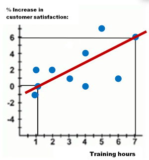
From the Line of Best Fit plotted on the chart above, the manager can see the approximate value of a % increase in customer satisfaction based on the number of training hours the employee had received so far at the firm.
The Employee A (on the left-hand side) with 1 training hour at the firm will contribute towards a negative -1% increase in customer satisfaction. Whilst the Employee J (on the right-hand side) with 7 training hours will contribute towards as much as a 6% increase in customer satisfaction. The remaining data points of representing the remaining eight employees are evenly distributed on both sides of the Line of Best Fit.
The Line of Best Fit is showed as the red linear line passive through the data points for Employee A (1,0) and Employee J (7,6). To find the equation for this Line of Best Fit, use the following formula:
y = c + b1(x1)
You can find b1, which is regression coefficient or the slope of the Line of Best Fit, by dividing (6-0) by (7-1) which equals 1. Then, substitute b1 in the formula with 1 to find the constant value c:
y = c + 1(x1)
Use values for either Employee A (x1=1,y=0) or Employee J (x17,y=6) to calculate c:
6 = c +7
c = -1
Hence, the equation for the red Line of Best Fit in this example is as follows:
y = -1 + 1(x1)
A starting point on y-axis of the Line of Best Fit (where x1= 0) will be -1.
To sum up, a Line of Best Fit helps to express the nature of relationship between the two variables by visually showing correlation.
